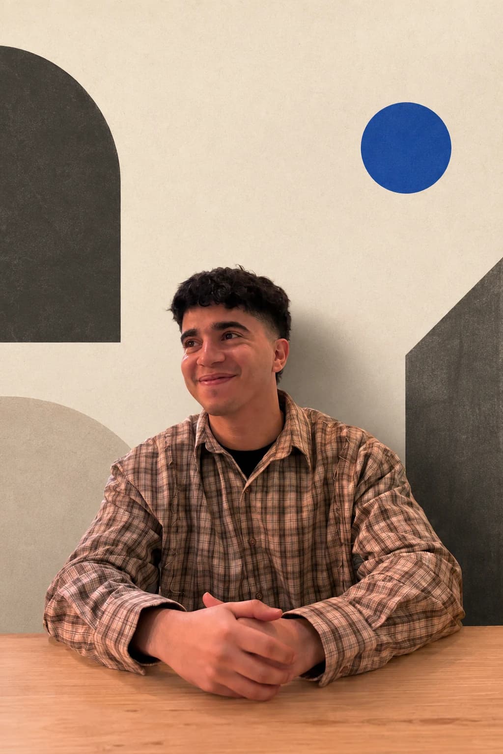
● The person behind Inceptweb
Hey, I'm
Mehdi.
I started Inceptweb because I got tired of seeing businesses handed the same website with different colors. I wanted to build something more thoughtful — websites shaped around how each business actually looks, works, and sells.
Small studio. Direct relationship.
Your project is handled by the people designing and building it — not passed through layers of account managers.
● Our story
A business should never look like everyone else's.
Inceptweb exists to give local businesses a digital presence that feels recognizably theirs. We study the customers, character, and day-to-day operation first, then shape the design and the useful systems around that reality.
Thoughtful design,
built for real work.
That means no recycled layouts, no unnecessary layers, and no systems added just for show. The goal is simple: make it easier for the right customers to understand, trust, and choose your business.